itmeJP Community


itmeJP Community

RollPlay Viewers Guide - Wiki

I think I should ask for logos, so they have a uniform size…

I pulled them from wikis and google (and since the old viewers guide is no longer online, I can’t find a proper logo for vigil. I wanted to place an ehbon and a vigil logo next to each other)

the blades logo is self-made with ultra cool photoshop skills

I sorted all the playlists not sure if it is any help here

1 Like

I think the best way to do this is to use the summary tag.

Guests

bla
bla

HTML seems to work within those tags so try it and see how it goes.

[details=Guests]
<strong>bla</strong>
bla
[/details]

the forum does not seem to like it when we mix HTML code and its own code. that’s why all the links are in <a href=""> format, and not the easy [text](url) version. I think the tables are messing with the system… :itmejps:

the CoS part took it… don’t know why something else didnt work then, earlier

edit: did the westmarches cast…

1 Like

added the link to the patreon. The image was taken from the youtube video. Maybe @TwitchSurgeon has has a better Rollplay Patreon logo.

1 Like

Maaaaan this and the One Shot version of this is turning into something super cool. Love that it’s added to the itmebot as well :smiley:
This is what I wanted from this community with people coming together and creating things.
I’ll try to get a Patreon logo for you guys but I have a lot of things this month so I might need to take a small step back for a little bit.

1 Like

while you’re at it… I would like to add official logos to both guides (the one-shot one doesn’t have any, yet)

one more thingy… when browsing the forum, the pinned posts get excerpts. is there a way to manipulate them? because the first sentence would be more than enough, at least for my two posts that are up there…

but I’m done for today :stuck_out_tongue:

I’ve been tinkering a bit…

Someone asked for twitch links, and I’ve added DriveThruRPG to the resources.
I like it! Don’t know about DriveThruRPG, since it might be too much advertising.

There’s a problem, though! The images that I use have been uploaded with this editor.
File name local:

“twitter-ico.png”

File names, once uploaded:

“32115adb932132126a4e075129cee2a51771e1.png”

This stuff adds up! The limit to a Post is 32000 signs/digits characters. As it is now it’s at over 27500, with the additional icons and links only for Blades, we’re at 29500. So, adding Twitch icons like that won’t work, at all!

edit: and there’s another problem with twitch links - the click counter… the icons would not be aligned at all (which would look silly, and at the very least bug me out), unless the counters can be disabled!

1 Like

You are talking about the post’s character limit?

Yes, that was the missing word :smiley:

I wonder if the @admins can increase the post count.
If that can’t be done I suppose a solution would be to use the post (making it a wiki as well) below the initial post as a continuation

perhaps adding in the first post something like

The RollPlay viewer’s guide continues in the next post (link)

I too like the way you formatted it.

@TheDesec The Mad Scientist!
Gave you guys another 10K characters :wink:

1 Like

Found a piece of CSS code for clickable tooltips… tinkered a bit… Try it here!

I don’t fully understand the code, yet. For example: I have no clue how to disable the circular alignment and make it straight. And the shadow settings are weird.

But I think clicking on a name and getting a menu for twitch, twitter and youtube links is the way to go…

That being said - it’s CSS, so someone would have to put the finished version into the CSS file for the forum… no idea if that’s something possible, or if you guys want that… but then it’s a feature for everywhere on the site!

Only basic HTML is allowed here so no CSS. The CSS would mess up the colors etc of the community. :itmejpded:

That’s what I’m getting at… someone at your end would have to edit something like this into the CSS code! It would be so neat and tidy :itmejplewd:

But you mentioned earlier that right now there’s no room for further dev… I’ll shut up about it :itmejphappy:

1 Like

Ah I see! It might be possible it would basically add another summary tag that’s a social media summary pretty much.

1 Like

Fuck. Me. The summary thing… been using it all along… how about that:

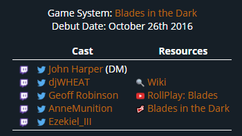
Cast Resources
[details=John Harper (DM)]         [/details]
djWHEAT


Geoff Robinson


Anne Munition


Ezekiel_III


Wiki
RollPlay: Blades
Blades in the Dark

…with plenty of room for more icons…

One thing that I dislike about this: the places, that already have summaries, will look shitty; like the multiple groups for the charity event 2014.

Secondly, I liked it when the names were orange. This might be an easy fix.

P.S.: I will not edit the entire thing before next weekend! So until then we can toss around some options :itmejpgg:

P.P.S.: I afraid of how it might look when click counters are coming in…
Edit:
P.P.P.S.: @TwitchSurgeon Anne’s twitter got a counter in this post now… I hate how that moves the other icon(s) over… do you think this can be disabled?

Awesome Guide @TheDesec , you may want to add Maggie Krohn to the Rollplay Vigil section she replaced Neal when he left the show to pursue other projects on his channel.

1 Like

I don’t know what you’re talking about, she’s there :smirk:

I’m still on Ehbon S2… so I didn’t know :slight_smile:

1 Like

Quick Update!

Changelog:

  • Added link anchors, so you can link to each show directly
  • Anchors are: solum, heresy, ehbon, vigil, rnd, swansong, wm, mirrorshades, bop, cos, blades
  • Usage: “URL to this page”#anchor - …/rollplay-viewers-guide-wiki/419#blades

New social links (like this, unless discussed otherwise) will be added on the weekend.