What are everyone’s thoughts on the new twitch UI. I hated it when they brought it to mobile and i hate it even more now they’ve expanded. It seems to hide all the information about streams i want to see. the clips on the home page are useless to me
3 Likes
I never go to the twitch frontpage. I rarely use the mobile app.
In the old design I was able to browse /directory/all and see a full list of streamers I follow on the right. I’ve seen all the big streams and everyone I care about and could easily switch and select.
Now I only see the top 5 followed streamers on the left, so I need to browse /directory/following/live to see everyone. If it was one click to get there from /directory/all, I would not care at all. But from /directory/all I can only reach /directory/following, where I would see the top 7 of my following and a “view all” button that leads to /directory/following/live.
I miss the list on the right hand side. There was a button to hide, just like with chat. The UI for hiding chat is still there.
Pro: None
Con: I no longer see large streams that are the hype of the day and/or events, unless I already follow or switch to /directory/all.
Aside from the moving and relocating of features, I think the new design looks better. But I wish the directory & followed people were accessible like before.
I don’t want to have multiple bookmarks.
Conclusion: 


 1 step forward (looks), 5 steps back (accessibility)
1 Like
I watch/listen to a lot of past broadcasts on mobile and this new UI is completely horrible at that. In order to watch a a twitch vod I need to do a search for a person who’s already in my follow list to see their homepage and then navigate to vods.
The fast switch between streams is completely useless because I want to choose who I watch not go to the next stream down the list (and it’s way to easy to swipe to another stream).
In fact the only thing I like is being able to switch to night mode.
1 Like
If you click the caster name title at bottom of screen on app it takes you to their homepage should save you time
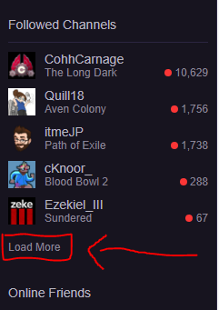
Web UI: Click the “load more” below the list, then I get a complete list, but my list isn’t very big (only 11).
there’s a heart icon (mouseover tooltip: followed channels), under that the top 5 streamer logos, then a camera logo that says “recommended channels” and underneath that icon 3 recommendations.
there’s no text, just a bunch of icons and nothing else.
You may have collapsed it to show only icons. There should be an arrow next to the heart to expand and the show more option will be at the bottom then. Not a permanent solution though, the next time you load the page, it will still only show the top 5.
The mobile app makes it much harder to get to vods, especially for a streamer that is currently live. The only way I’ve found to do it is to select the streamer, which loads the stream, and then tap their logo. I’m pretty excited that chat is finally on mobile vods though.
It is collapsed. That image @crowly_ posted is completely new to me! I see no arrow… it has been there in the old design… as well as on the other side with the old follow list and chat,
Not there in my view.
Edit: LOL when I maximize my browser window the uncollapse arrow appears. My screen is too large to max windows… so I never do that… stupid “feature”. I mean that’s the old list that I want… just… I don’t know… I really don’t want to max any windows…
Edit2: Found an acceptable window size that suppots large list (~15% larger of what I’m used to use). And I don’t have to have it that way all the time. Thanks guys 

Oh dude Twitch and window size is a nightmare for us designers. Twitch’s resizing is, at times, very unforgiving.
2 Likes