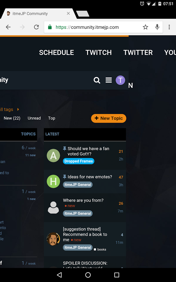
Not a big issue, but the nav bar is not responsive and on my tablet (nvidia shield) it falls of the right side in while in portrait
1 Like
Yes sorry the top navbar is pretty shitty at the moment. I need to dig a bit more into the css and see if I can’t fix it.
It is not perfect but this should do the job.
@media (max-width:1020px){
    header.site {
        width: 768px;
        height: 142px;
    }
    ul.nav_main>li>a, ul.nav_main>li>span {
        padding: 20px 18px;
    }
    ul.nav_main {
        width: 500px;
    }
}

@media (max-width:785px){
    header.site {
        width: 100vw;
        height: 214px;
    }
    ul.nav_main {
        width: 300px;
    }
}

@media (max-width:535px){
    header.site {
        height: 314px;
    }
}
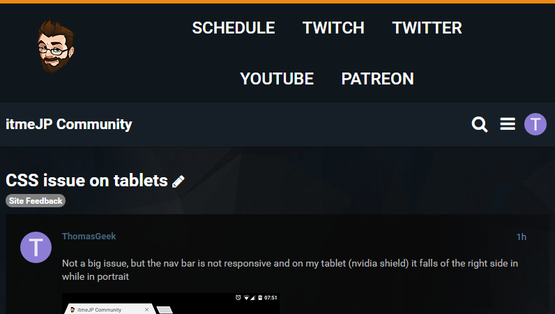
Looks like this
1 Like
Thank you for this 
I’ve added it in now so let me know how it works/looks.
Wow you’re quick!
No worries, I had some spare time 
Looks good to me 
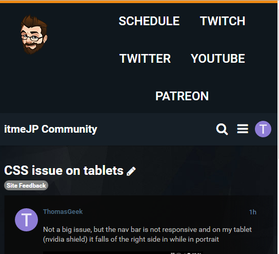
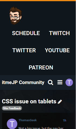
I edited my original post to show screenshots
1 Like