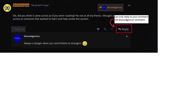
@TwitchSurgeon, A couple things that I had no idea until reading through your conversation with disusedgenius. First that you can expand by clicking the name in the upper right corner that shows who is being replied to. Second, that when you expand the reply there is a small arrow in the top right corner that you can click to take you to the spot where the reply is.
I personally don’t think they are too useful and can confuse a topic more, but that may be a matter of preference there. Secondly, and if I read a reply to a comment it would be nice to be able to reply directly to the reply rather than have to go down to it. Although now knowing you can jump to the reply does help, it does feel like an unnecessary extra click.
While this community site does look nice, and is great for being able to categorize discussion and keep people involved in threads they like, I very much dislike the organization within threads on this system. It feels cluttered and unnecessarily inflated. If the organization within a thread was a bit cleaner, I think this forum would be perfect.

 should be here

